Corporate Design
*
Corporate Design *
Commitment to clarity, consistency, and strategic visual communication."
Corporate design projects that enhance brand recognition and reinforce business objectives.

Hill Country Bridge Group.
Explore the cohesive branding and corporate design that builds confidence and trust for a loan company in the construction and bridge market.
This brand book and corporate design for Hill Country Bridge Group aims to establish a strong, trustworthy, and authoritative visual identity that resonates with its target audience of construction professionals and developers. The design language prioritizes clarity and stability, using a palette of deep greens to evoke a sense of reliability and financial strength. The typography is clean and professional, with a focus on legibility and impactful headlines. The logo, featuring a bridge-inspired motif, symbolizes structural integrity and financial support. The brand book provides detailed guidelines for logo usage, color palettes, typography, imagery, and messaging, ensuring a consistent brand experience across all touchpoints, from website and marketing materials to presentations and client communications. This cohesive corporate design system reinforces the company's position as a dependable and knowledgeable financial partner in the demanding construction and bridge industry.
Design Goal:
The design goal of this brand brand book is to establish a clear, consistent, and comforting visual and verbal identity that resonates with our target audience. We aim to create a document that embodies the brand's core values. We'll define precise guidelines for logo usage, color palettes, typography and messaging, ensuring that every touchpoint – from packaging to digital advertising – reinforces the brand's commitment to providing a superior sleep experience in a high quality mattress. Ultimately, this brand book will serve as an essential tool for maintaining brand consistency and building a strong, trusted identity in the competitive mattress market.
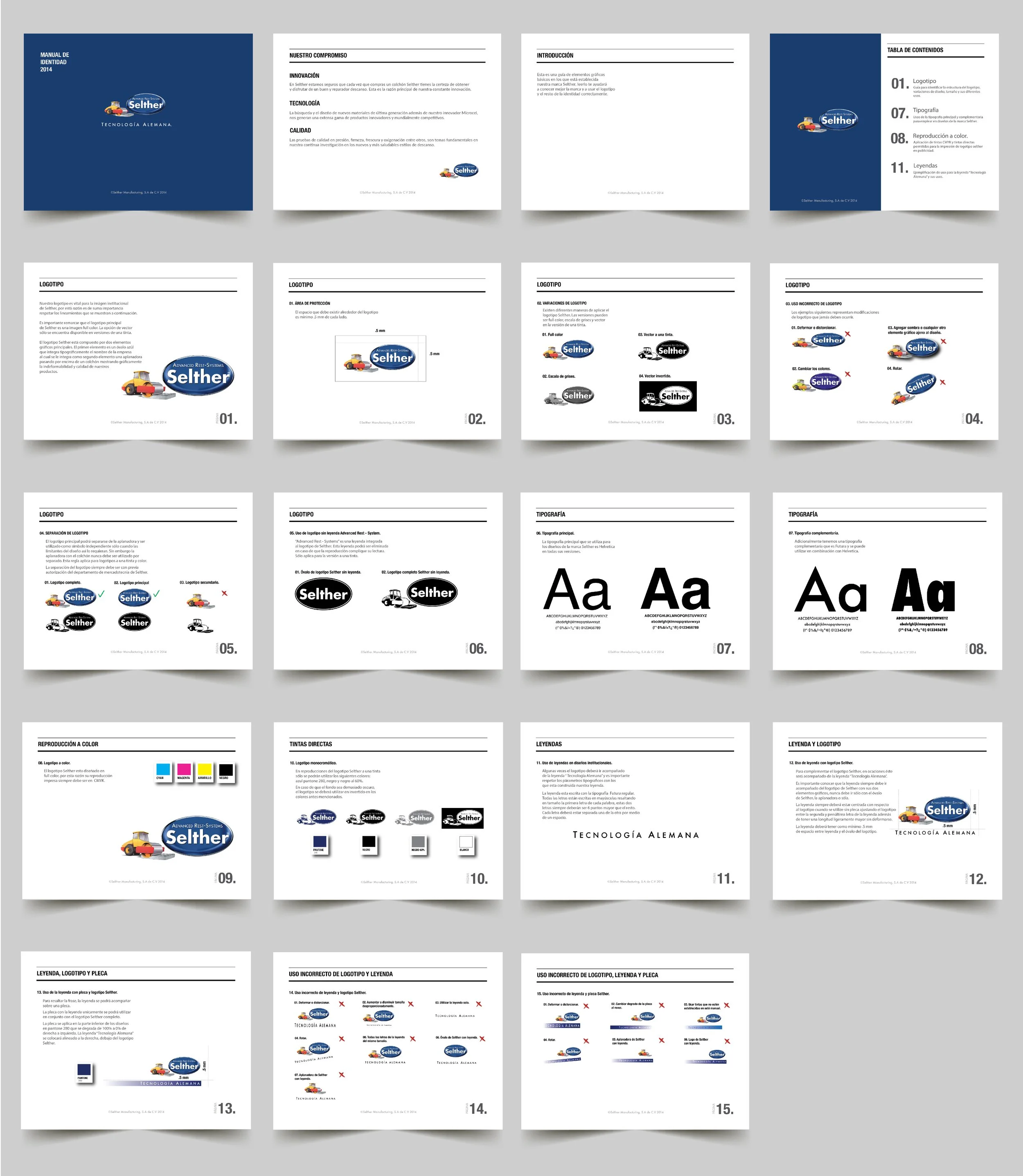
Welcome to the Selther’s Brand Book, a comprehensive guide to our visual and verbal identity. This document outlines the principles that shape our brand and ensure consistent communication across all platforms.
Selther’s Brand Book

Pixie Dust Travel Agency.
This corporate design for a travel agency, inspired by a fun and approachable brand essence strategically utilizes a pastel color palette of pinks and purples to create a unique and memorable visual identity. While maintaining a professional and trustworthy foundation, the design incorporates playful elements and soft, inviting hues to evoke a sense of adventure and lighthearted exploration. Clean, modern typography is juxtaposed with whimsical graphic accents, creating a balance between sophistication and fun. The logo, featuring stylized travel motifs reinforces the agency's commitment to creating joyful and memorable travel experiences. This design approach aims to resonate with a diverse clientele, from families seeking relaxing getaways to young adventurers eager to explore new destinations. By blending corporate professionalism with a vibrant, pastel-infused aesthetic, this travel agency stands out in a competitive market, promising both reliability and delightful experiences.
This corporate design infuses a fun, approachable travel agency with a vibrant pastel palette, blending professionalism with playful charm.

JE: Business Consultancy
This corporate logo, defined by clean straight lines, projects a sense of precision and strategic clarity for a business consultancy.
Design Goal:
This corporate logo design for a business consultancy utilizes a striking combination of straight lines and a directional arrow to convey a sense of precision, strategic movement, and forward-thinking solutions. The clean, geometric lines establish a foundation of stability and professionalism, reflecting the consultancy's analytical and structured approach. Interwoven within this linear framework, the arrow symbolizes progress and advancement, highlighting the consultancy's commitment to guiding clients towards their goals. The integration of the owner's initials, subtly incorporated into the linear design, adds a personal touch, reinforcing the consultancy's dedication to tailored, client-centric service. The overall aesthetic is modern and sophisticated, aimed at projecting an image of competence and strategic expertise, essential for building trust and credibility with discerning business clients.

Design Goal:
This corporate logo design for a handmade jewelry brand delicately balances artisanal craftsmanship with refined elegance. The soft, muted color palette reflects the gentle nature of the handmade pieces, while the classic serif typography conveys a sense of timeless sophistication and enduring quality. At the heart of the logo, an inverted triangle with a horizontal line at its base, reminiscent of the alchemical earth symbol, anchors the design, subtly alluding to the natural origins of the gemstones. Superimposed or nestled within this triangle is a stylized crescent moon, symbolizing silver, the brand's primary material. This combination of alchemical and celestial imagery creates a unique and memorable visual identity, speaking to both the organic beauty of the jewelry and the ethereal allure of its primary material. The overall design aims to resonate with a discerning clientele who appreciate the blend of artistic expression, natural elements, and refined craftsmanship inherent in the brand's creations.
This corporate logo embodies elegance and sophistication, reflecting the timeless beauty of handmade jewelry.