Packaging & Branding
*
Packaging & Branding *
Brand Stories, Unwrapped: My Portfolio.
Explore a collection of packaging and branding solutions designed for diverse brands, demonstrating my ability to blend creativity with functionality.
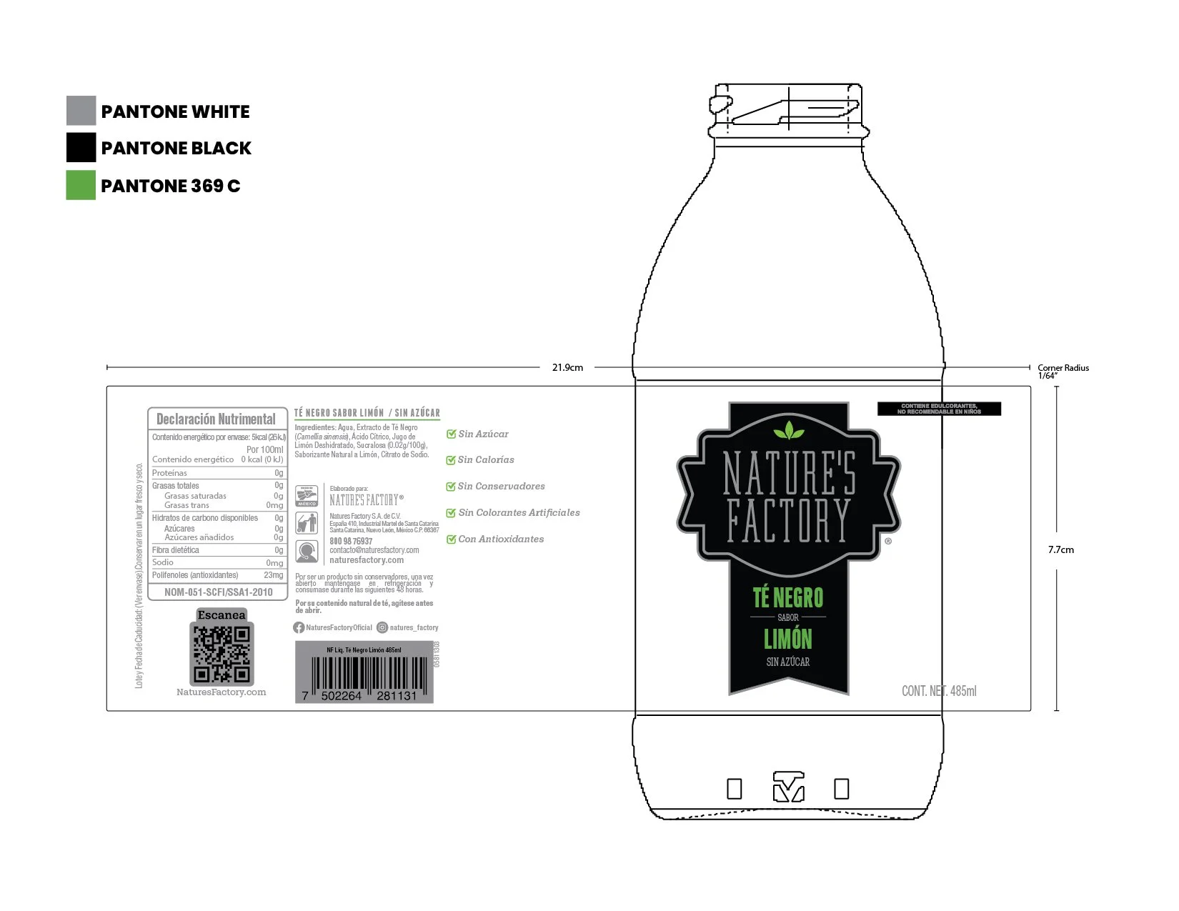
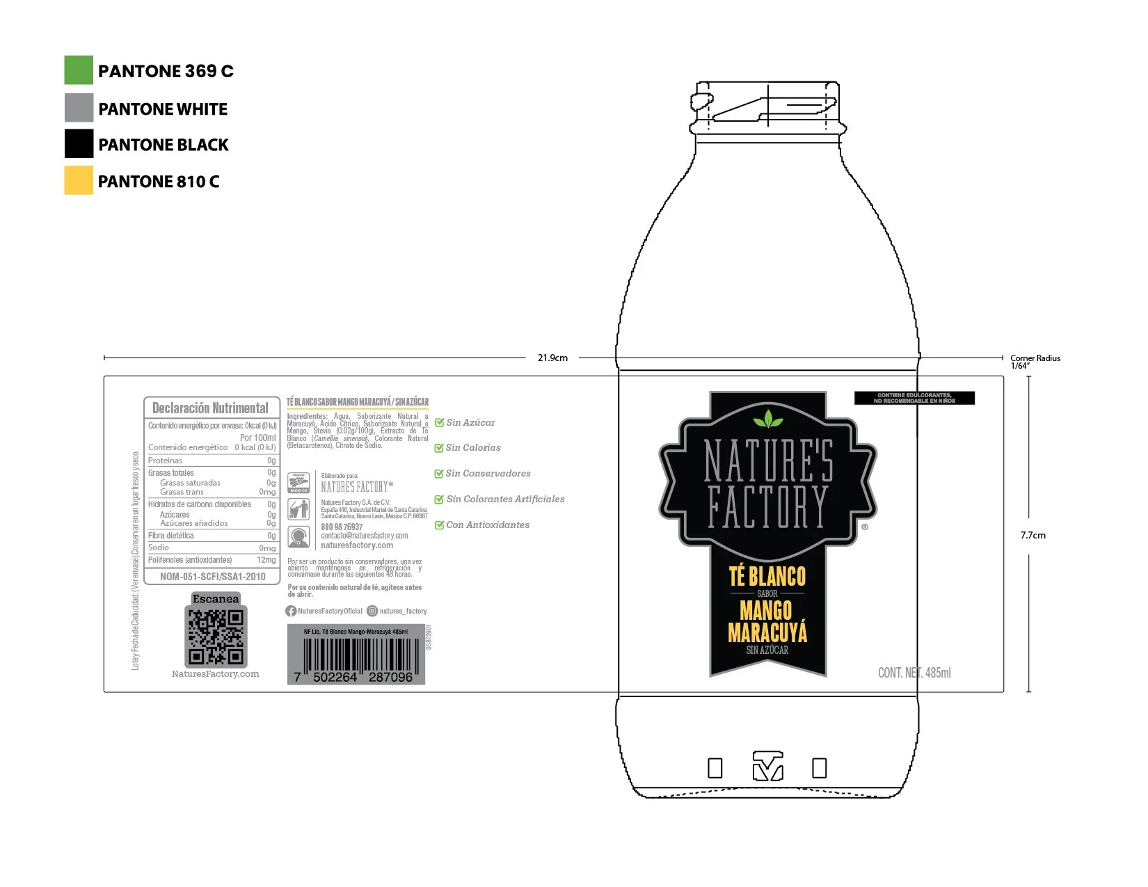
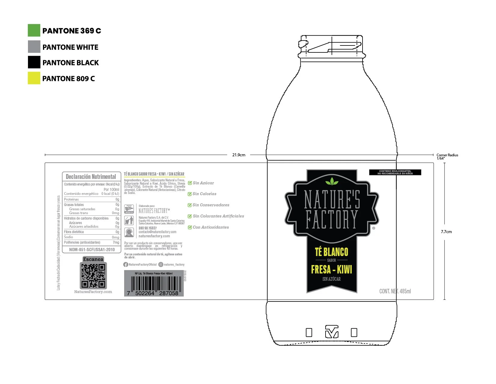
Nature’s Factory.
Nature's Factory: Where the purest ingredients meet mindful creation.
We bring you the best of nature, crafted with care.
BRAND LOGO DESIGN
Problem:
The brand used to have different logos, this brings inconsistencies and areas for improvement.
Brand Goals:
Unify all the logos highlighting the flavor taking extra care of the brand's essence considering the core of its identity, values, and emotional connection with customers.
Why:
A consistent logo across all products creates a stronger visual association in the consumer's mind.
Homogenization reduces confusion and makes the brand instantly recognizable, even in diverse contexts.
It ensures that the brand presents a consistent image, regardless of the application (website, packaging, advertising).
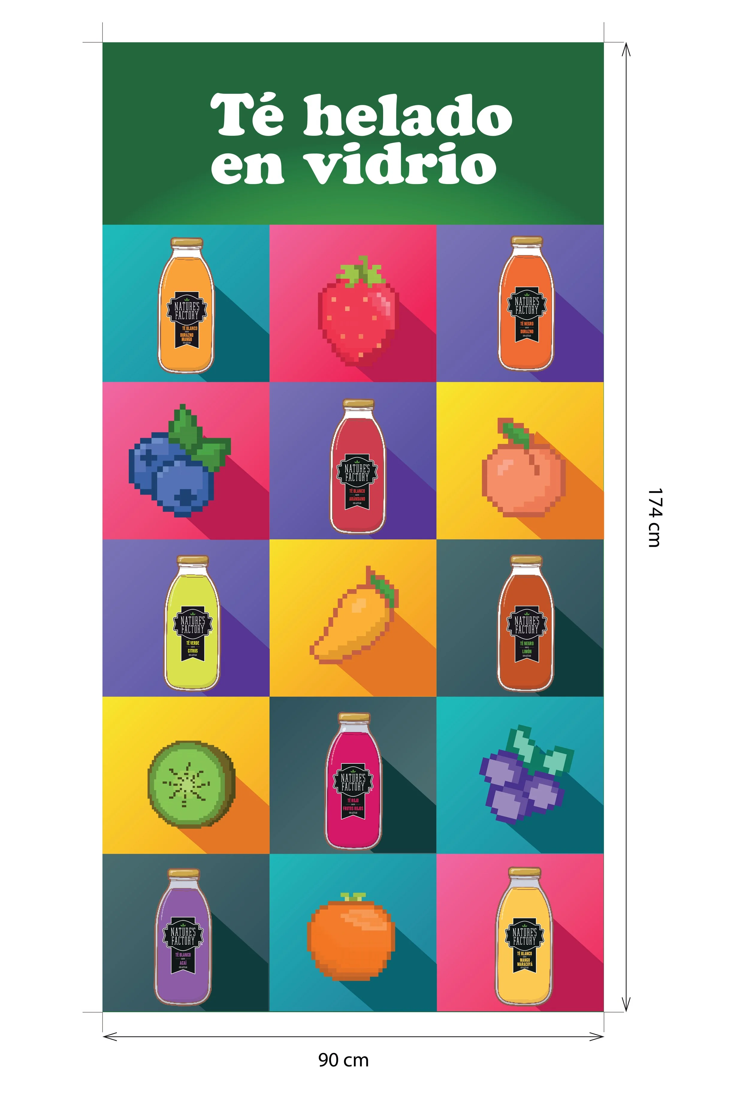
Nature’s Factory Vending Machine
Introducing a refreshing break: a vending machine offering a variety of naturally sweet, sugar-free teas.
Enjoy a moment of wellness, anytime, anywhere.
Design Goals:
Our vending machine design aims to capture the nostalgic charm of vintage pixel art, blending it seamlessly with the modern appeal of the natural, sugar-free teas. The visual language will feature vibrant pixelated fruits , reminiscent of classic arcade games, creating an engaging and memorable user experience. The design will also prominently showcase the tea brand's bottle, integrating its familiar aesthetic into the pixel art environment to reinforce brand recognition. The overall goal is to create a visually appealing, user-friendly vending machine that stands out, offering a delightful and healthy refreshment option with a touch of playful nostalgia.
Nature’s Factory Combi
Bringing our tea brand to you, one event at a time. Our stylish combi van is the perfect mobile ambassador, spreading the love of tea far and wide.
Design Goal:
Our combi vehicle design aims to capture the free-spirited essence of the 1970s, transforming it into a vibrant, mobile tea experience. The exterior will feature a bold, retro color palette, inspired by classic 70s patterns and hues, with the tea brand's bottle seamlessly integrated into the design. We'll utilize playful graphics reminiscent of the era, creating a visually compelling and nostalgic atmosphere. The goal is to create a visually striking and welcoming space that embodies the relaxed, communal spirit of the 70s, while promoting our tea brand's natural and refreshing qualities at events.
Selther and Simmons: Rebranding
Dreamy nights, happy mornings. Introducing the reimagined child mattress, designed for ultimate comfort and peaceful sleep.
Design Goals:
The rebranding of our child mattress focuses on achieving a clean and minimalist aesthetic, prioritizing simplicity and functionality. Our design goals center on creating a serene and uncluttered visual experience that promotes restful sleep. We aim to use a neutral color palette, soft typography, and subtle textures to convey a sense of calm and tranquility. The mattress itself will feature smooth, seamless surfaces and a streamlined silhouette, eliminating any unnecessary distractions. The packaging and marketing materials will reflect this minimalist approach, emphasizing clear, concise messaging and high-quality imagery that highlights the mattress's comfort and support. Ultimately, we seek to create a brand that resonates with modern parents who value simplicity, quality, and a peaceful sleeping environment for their children.


